Thought it might be a nice idea to put up a post about how the new logo came into existence. It’s a bit long-winded and meandering, but I really enjoyed the process of designing the logo so thought I’d like to explain that process. I always like the behind the scenes features on DVDs etc, so here is some Subbuteo behind the scenes (and, being an art teacher by occupation, I just can’t help myself!).
I was given a design brief by Benji Batten and Peter Thomas that our new logo should be green and gold, that it should contain the title of the organisation (Australian Table Football Association) or, at least, its initials and that it should also identify the actual game through the use of a Subbuteo figure or something similar.
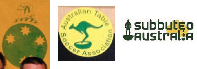
My first point of call was to look at all the old logos for Subbuteo in Australia. There were three that I could find – it’s probably a good idea to honour those here. Trawling through old photos on the internet, most courtesy of Steve Dettre, I found these (blurry) images of different past logos…
I also looked through dozens of various club and international Subbuteo logos. While many were underwhelming from a design point of view, there were quite a lot of strong ideas, though one of the main reasons for looking through these was more to see what the clichés to avoid were, in order to have a distinctive logo. I was also keen to avoid basing our logo on variations of already existing, official logos (Subbuteo, FISTF, WASPA etc). I also have to say, the previous Australian ones were all good from a design point of view in that they were bold, simple and clear and some of my initial sketches were based on developing ideas found in those old logos.
The first practical step, then, was to get out my sketch book and pencil, and begin doodling. This page of drawings, which is how I always generally begin when needing a new design, is fairly stream of consciousness, loose, and you can see ideas develop across different parts of the page. In some of these you can see the links to old logos, some were just Subbuteo type shapes in an attempt to inspire ideas, some were abandoned mid-drawing, and some are completely new ideas that were sketched out quickly and developed a bit.
![]()
The one with the player’s base and half football was an idea stolen from a club in Belgium, and was one I quite liked and developed further. I was also thinking that having a finger in there might be nice to give an idea of how the game was played, as I hadn’t noticed that in other logos I’d seen anywhere. So, the hand making a map was a development of that idea. In the end, I couldn’t work out how to make that one without it being too cumbersome, so I abandoned it.
The next step was to take some of the good ideas and turn them into digital images. Two of them came from the pencil sketches. The other two came when trying to think of ways to make the logo ‘Australian’ without relying on clichés such as kangaroos and maps. That’s when I had the idea of using iconic Australian football images. Over the last 12 months, I’ve been designing a monthly ad for a small music label I run which was published in an English music magazine, Wire. The name of the label is 4-4-2 Music, so I took the football angle and the Australia angle into the ads, depicting a different great moment in Australian football each month. So this gave me a bit of inspiration for the logo. The two most iconic single images I could think of were Tim Cahill’s corner flag boxing and John Aloisi’s triumphant run after scoring THAT penalty. So I found images of these online (finding a good, full body shot of Cahill’s boxing kangaroo proved far harder than I imagined it would be!) and transformed them into single colour icons. So, that means the first four logo ideas I presented to Benji and Peter were these…
![]()
I didn’t say anything when presenting them but, of these, my favourite was the John Aloisi, so I was extremely happy when both Peter and Benji said they thought it was the best idea to work with. So, the next step was to develop that idea. The intial text was just kind of there to give a bit of movement, but I played around with more traditional text formats for logos…
![]()
My favourite of these was the half circle one. It had a finesse the other didn’t have due to their larger lettering. It also highlighted the sense of movement in the icon, with all the weight pulling to one side. Lastly, from a designer’s point of view, I was quite pleased with the idea of having something that didn’t fit into a traditional circle or shield shape but still hinted at it.
At this stage, the different functions needed to be fulfilled by the logo began to become a concern to me. When the old Australian logos were designed, they would generally only appear on badges, shirts, pennants etc. But, in the digital world, one of the most common spots for this kind of thing is the web page banner – on places like Facebook or here on the website, as well as possible future banners etc. So, I decided we needed a logo that had a flexible form, so it could take a traditional logo space, or also an elongated form, but still be recognisable as the same logo. The main issue became how to fill up space sideways. This is where the initials from one of the other original designs came in handy. By laying them in behind the Aloisi icon, the actual full title of the association could be moved around while still keeping the logo intact. So the long version was created fairly easily…
![]()
What was much harder, however, was deciding on a format for the traditional logo. The new initials behind the image suggested a shield shape, so I tried a few variations on that. I was also trying to find the best way to include the full name. At first, I even toyed with the idea of leaving it out completely, thinking it’s probably a bit redundant to have initials, then the full words explaining the initials but, as I researched more logos, especially regular football club logos, I found that it was fairly common practice so ended up being happy to have both. So here are a few ideas for incorporating the full name within a traditional logo, or not, that also links to the long form version…
![]()
I was always a bit torn by the shield versions. They worked, but it reminded me too much of a rugby league logo for some reason. However, one thing that did jump out at this stage happened when, in Photoshop, the round logo was shrunk down very small on the screen. When I quickly glanced at it, it looked a bit like a football, with the shadowing effect of the writing giving it something of a 3D effect. I know Peter and Benji were fairly keen on an enclosed logo, and this became my way of being happy to enclose the space I had liked being open for so long. Enclosing it enhanced the effect of it looking like a football! So, it became enclosed and everyone was then quite happy with the outcome. We thought we were done.
![]()
All that was left to do was to insert them into the appropriate websites. However, this presented another problem. The long logo, even at this width, was still too narrow to really look good as a web page header. It needed to stretch out more. The other issue was, different pages had different required widths – Facebook, for example, needed a much wider image, proportionally, than our website here on WordPress. This lead directly to the final addition, a fairly simple solution to the problem, but one which tied all the bits together even further. A few gradient lines stretching out after the letters added to the feeling of the movement in the Aloisi figure and it was also easy to be able to adjust the length of those strips to fit any required width, without needing to affect the actual logo at all. Which was perfect! Of course, once the strips were in the banner version, they needed to go into the logo version for the sake of continuity. This had another added bonus effect. As Peter pointed out, the logo, as it was, still had probably a little too much blank space – a hangover from my versions without a border. Adding a little of the gradient strips inside the logo filled some of that space, still left some to please me, but also added significantly to the sense of movement of the figure, and the illusion of the whole thing, when seen quickly at a small size, of looking like a 3D football. And, so there were the final versions.
I must thank Benji and Peter who were critiquing and suggesting continually along the way and whose suggestions lead to a logo which I really like and which, I think, serves all the purposes we need it to. It has everything we set out to do – Australian-ness, simplicity, flexibility, attractiveness and a bit of individuality amongst the sea of good and bad Subbuteo logos out there.
![]()
Adrian